Liquid Glass is Apple’s new design language
What Does Apple Want to Change About Its Homescreens? An Analysis of Apple’s “Liquid Glass” Design Language and the Feelings of It
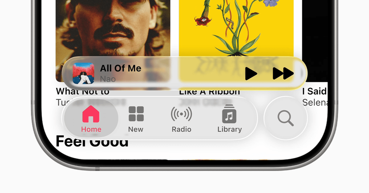
But I’m not impressed, and I’m not optimistic. Apple is at its best when it has strong opinions about how things should work; even the attempt to get out of the way and let your content dictate everything feels like the wrong tack. I have tinkered with Apple’s new tinted and color-matching homescreens, which mostly serve to make your device uglier. I think that Liquid Glass wouldn’t make my devices better, simpler or more personal. I can see that buttons are difficult to read.
Apple has also used glass themes in the past, most notably with the introduction of Aqua, which first appeared in iMovie 2 in 2000 before rolling out more broadly in Mac OS X 10.0 in 2001. A lot of new icons and a redesign of the macOSUI were introduced with the release of macOS 11 Big sur.
Microsoft has also been using transparency effects in its Windows operating system since it launched Windows Vista in 2007, complete with its own Aero Glass theme. The current version of Windows 11 now uses Microsoft’s Fluent Design language, which increasingly has more of a focus on 3D, colorful, and playful elements.
According to Steve Jobs, design is how it works. And if that’s the case, Apple’s new design language, which the company is calling “Liquid Glass” and just announced at WWDC 2025, is really nothing new at all.
Leaving aside the somewhat wild decision to pivot your entire UI system around a prohibitively expensive headset hardly anyone has ever even tried, the thing about most of Apple’s devices is that they aren’t overlaying digital information on the physical world. They’re just screens! If you highlight something on a page, you’ll feel like you’re poking at a fake waterdrop on the screen, because the little glass loupe won’t feel like you’re moving anything around. The controls that appear to float over the content, looking to my eyes like a 3D effect, are similar to a hokey 3D effect. The navigation buttons that ripple as you scroll a webpage don’t look like physical objects — they just look busy and hard to read. Apple executives frequently made a point of noting that Liquid Glass is minimalist and “keeps your content in focus,” but the constantly morphing interface feels to me like it might be even more noticeable.
This is where Apple came from in the broadest sense of the word. It obviously wouldn’t, and probably couldn’t, fundamentally change the look and feel of every device it makes for billions of users around the world. No one wants that. Apple has taken all of its elements and made them 888-282-0465 888-282-0465, which means everything is a little more rounded, a little more contained, and less designed for a specific screen size. A floating menu of black and white icons works pretty much anywhere, you know? Menus that pop out of buttons will prevent Apple from having to change every menu for each device and screen orientation. Liquid Glass is the most common of all of the common denominators.